Quiet zone, contrast and minimum size
Scanning in the real world Print quality Lesson 10 of 14
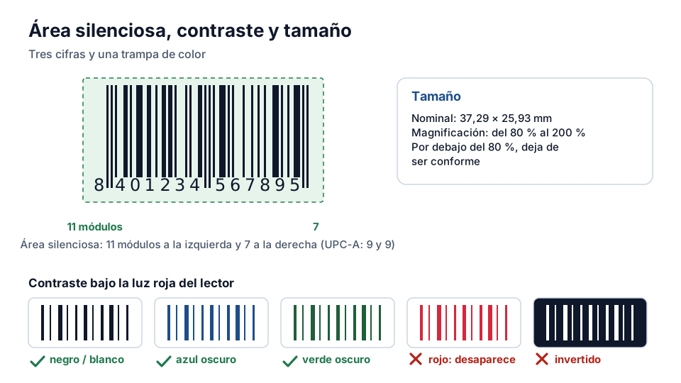
The quiet zone is the mandatory blank margin to the left and right of the symbol. It isn't decorative or a layout whim: it is the signal the scanner uses to identify where the barcode starts and ends. A label with the logo stuck to the symbol — the classic design mistake — can make the barcode never scan at the checkout even if the bars are perfect. The minimum width depends on the symbology and the magnification: in EAN-13, eleven modules on the left and seven on the right, which it is worth leaving with room to spare when the design allows.
The contrast that really matters
Contrast is measured between bars and spaces, not between “black and white”: what matters is the difference in reflectance at the scanner's wavelength. Dark bars on a light background work; reversing the colours (dark background, light bars) usually fails because the scanner expects bars that absorb light. And a classic trap: pure red disappears under laser light — a barcode in red on white reads as all spaces. If your brand demands red, it goes in the spaces or in the human readable interpretation, never in the bars.
Textured, embossed or transparent backgrounds (glass packaging, metallised films) are another minefield: the texture introduces “noise” that the scanner interprets as phantom bars. The usual solution is an opaque white patch under the symbol — visible on millions of yoghurt and tin labels once you know to look for it.
The minimum size and its real limit
The magnification range of the EAN-13 goes from 80% to 200% of the nominal size, but the real limit is set by your printing system: each technology has a minimum module it prints sharply — industrial flexography isn't an office laser printer. Shrinking the symbol “so that it fits” below what your printer does well produces fattened edges and reads at the third attempt.
The right sequence of decisions: choose the size the pack allows, check that it is within the symbology's range, confirm that your printer handles it well (with a real sample), and verify. If it doesn't fit, the alternatives, in order, are: reorienting the symbol, redesigning its surroundings, and only at the end considering an EAN-8 — which is a different identifier, with its own licensing.
The figures to remember
In EAN-13 the quiet zone is eleven modules on the left and seven on the right; in UPC-A, nine on each side. A module is the narrowest bar of the symbol, so the margin grows and shrinks with the size of the barcode: it isn't a fixed measurement in millimetres, and that is the misunderstanding that ruins most final artworks.
The nominal size of the EAN-13 is 37.29 × 25.93 mm, and the standard allows a magnification factor of 80% to 200%. Below 80% the symbol is no longer compliant and whether it reads depends on the luck of the particular scanner — which in the customer's shop may not be the same as the one in your warehouse.
Red and other colour mistakes
The rule is counter-intuitive: what matters isn't the colour as the eye sees it, but how it behaves under the scanner's red or infrared light. Red behaves like white and disappears; orange and yellow, almost the same. On the other hand, dark blue, dark green and black work well on a white, yellow or light orange background.
Hence the practical recommendation for printing: dark bars on a light background and, when in doubt, black on white. Any other combination has to be verified before running the first reel, not after.
Exercise
What makes a barcode readable
Why does reading a barcode sometimes fail?
- Because of poor printing, the wrong size or insufficient contrast between bars and spaces
- Because the product is out of stock in the warehouse
- Because the price isn't up to date in the system
What is the quiet zone of a barcode?
- The mandatory blank space before and after the symbol
- The inside of the thickest bars
- The area of the label where the logo goes
Related lessons
Reading is free. When you sign up, you also:
- You save your progress and pick up where you left off
- You take the exams, marked straight away
- You receive a completion record, with your name, for each course you finish
- You ask and answer in the Community (in Spanish)
- You get the PRO level by adding your products
- With PRO, you unlock the advanced tools: labels, GS1-128 and SSCC
Unlock PRO tools and completion records Free. The team reviews every application.
Already have access?Mark this lesson as read in My academy
This lesson is part of the course Barcode and GTIN Fundamentals, from the Barcode and Traceability Academy.
This module includes the exam “Module 2 exam: Scanning and quality”.
Next lesson Symbol verification: what a verifier measures 4 lessons left in the course